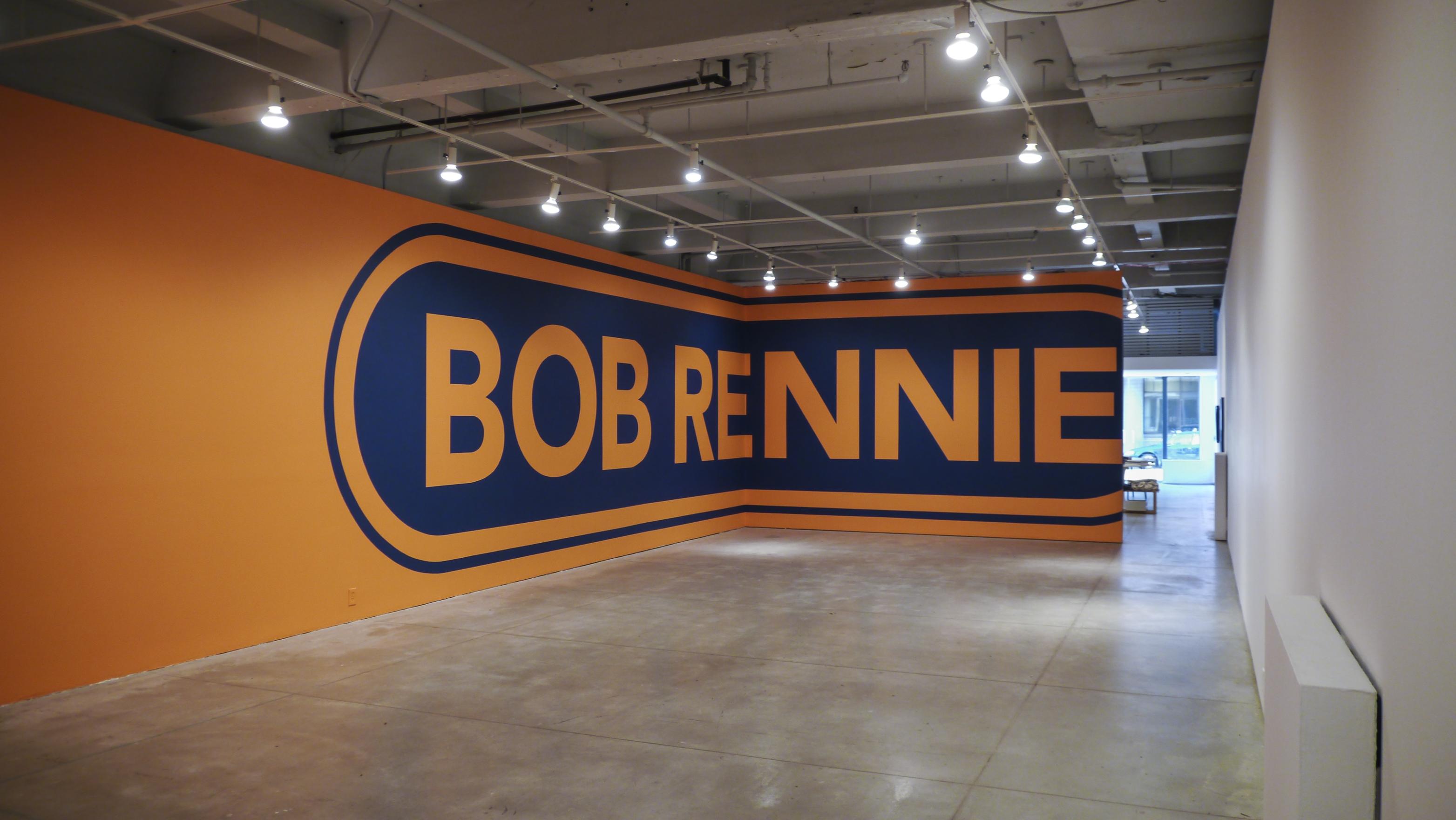
PATTISON, exhibition shot, wall-text painting, Or Gallery, Vancouver, 2013. Photo: Or Gallery
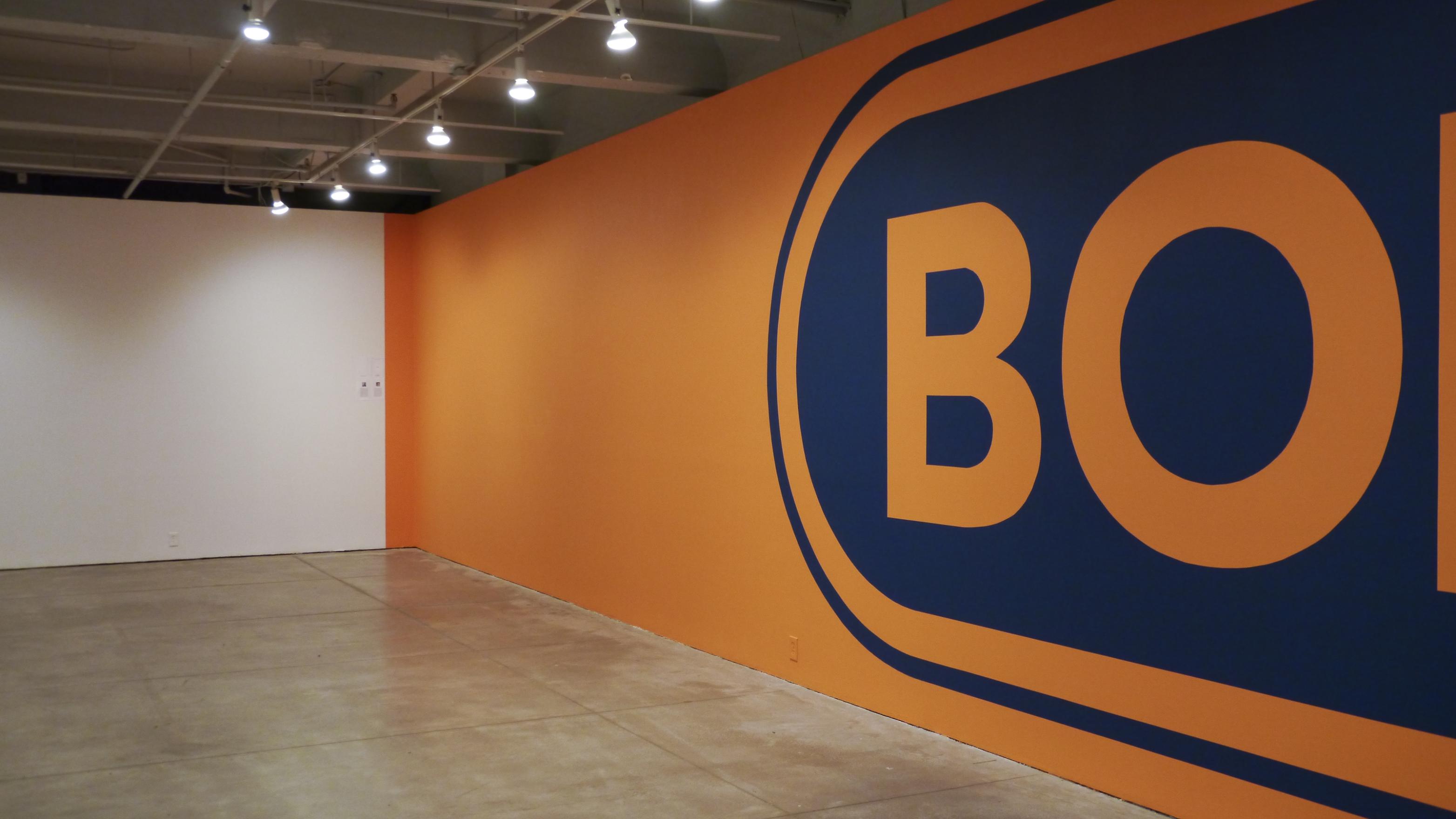
PATTISON, detail, wall-text painting, Or Gallery, Vancouver, 2013. Photo: Or Gallery
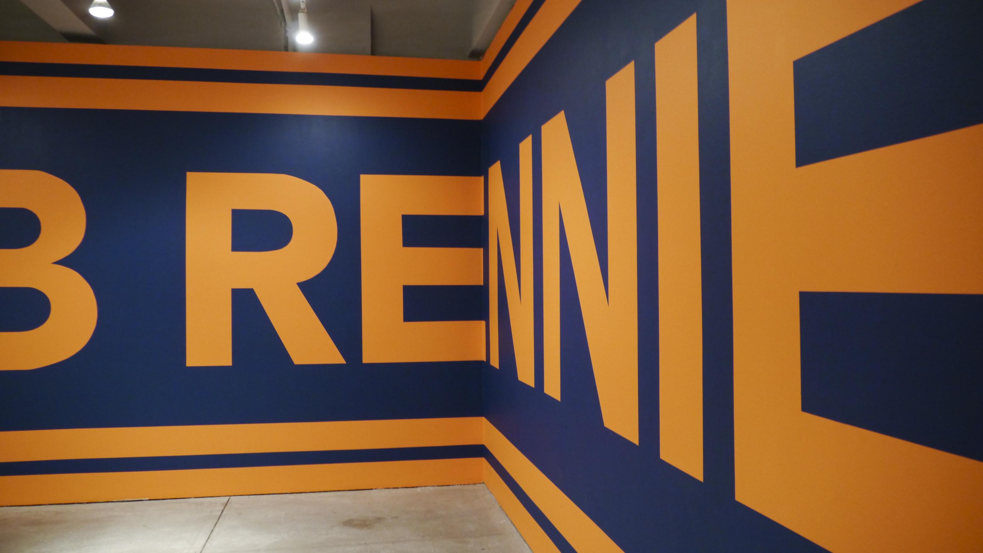
PATTISON, detail, wall-text painting, Or Gallery, Vancouver, 2013. Photo: Or Gallery
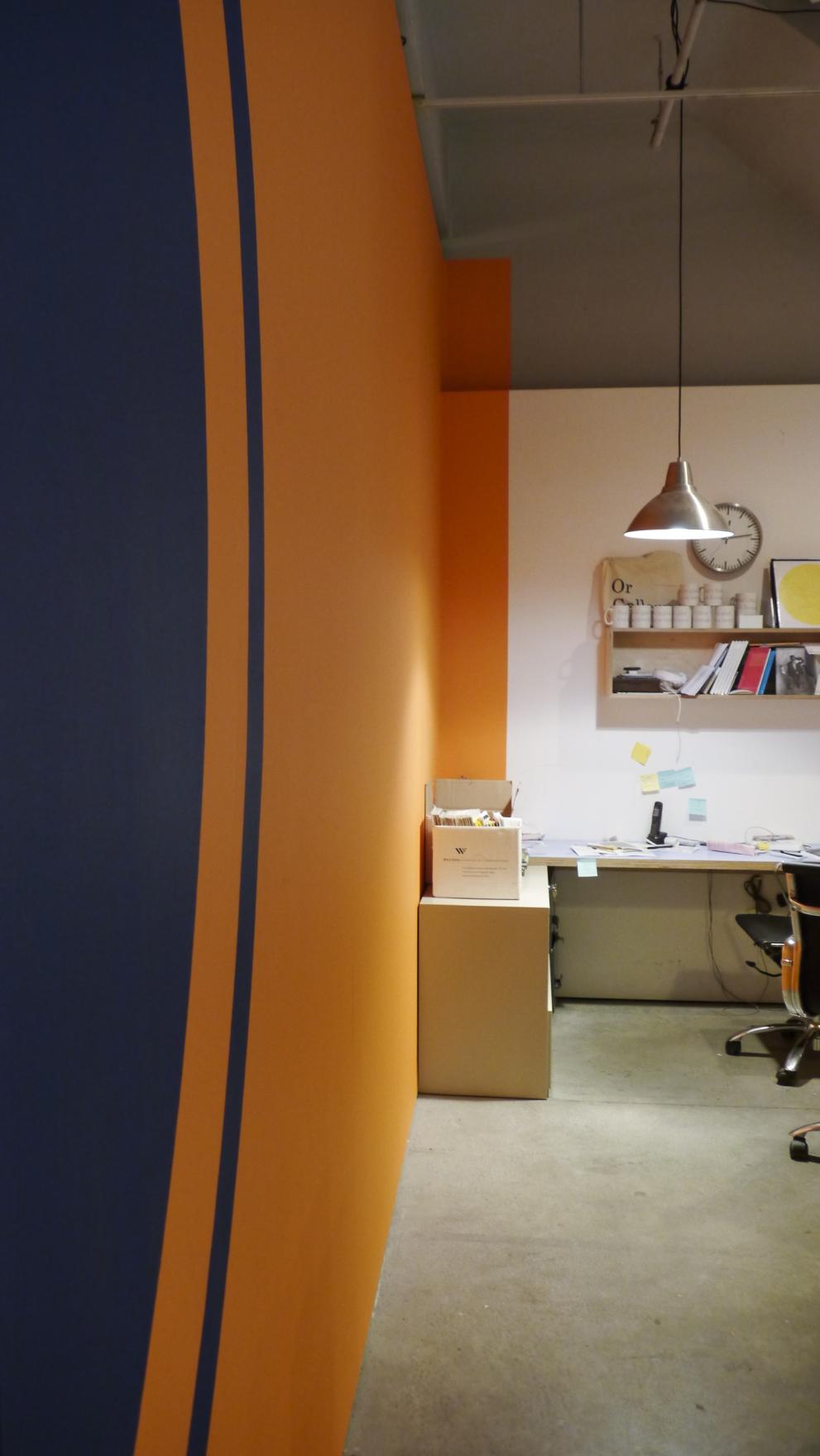
PATTISON, office detail, wall-text painting, Or Gallery, Vancouver, 2013. Photo: Or Gallery
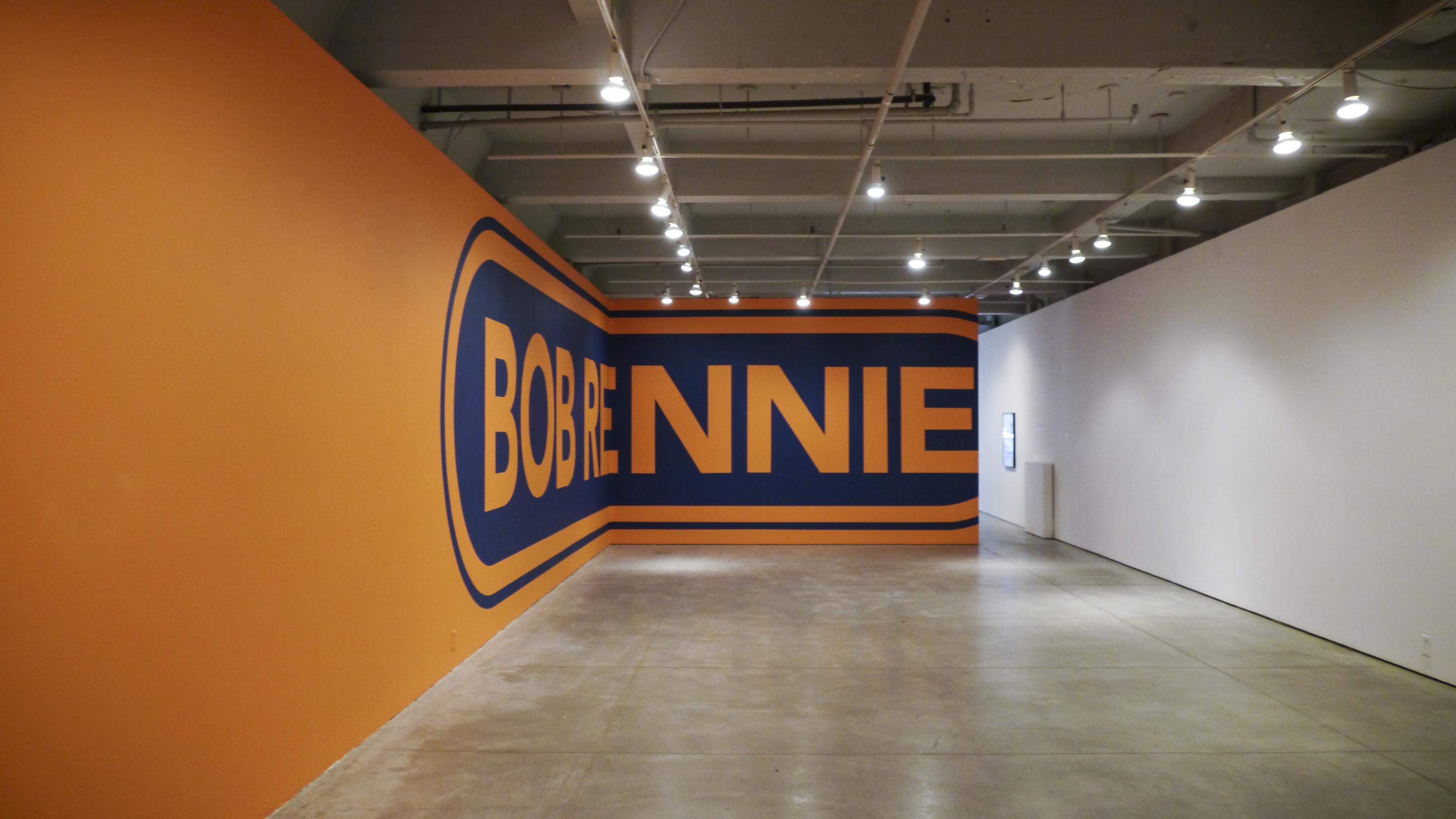
PATTISON, exhibition shot, wall-text painting, Or Gallery, Vancouver, 2013. Photo: Or Gallery
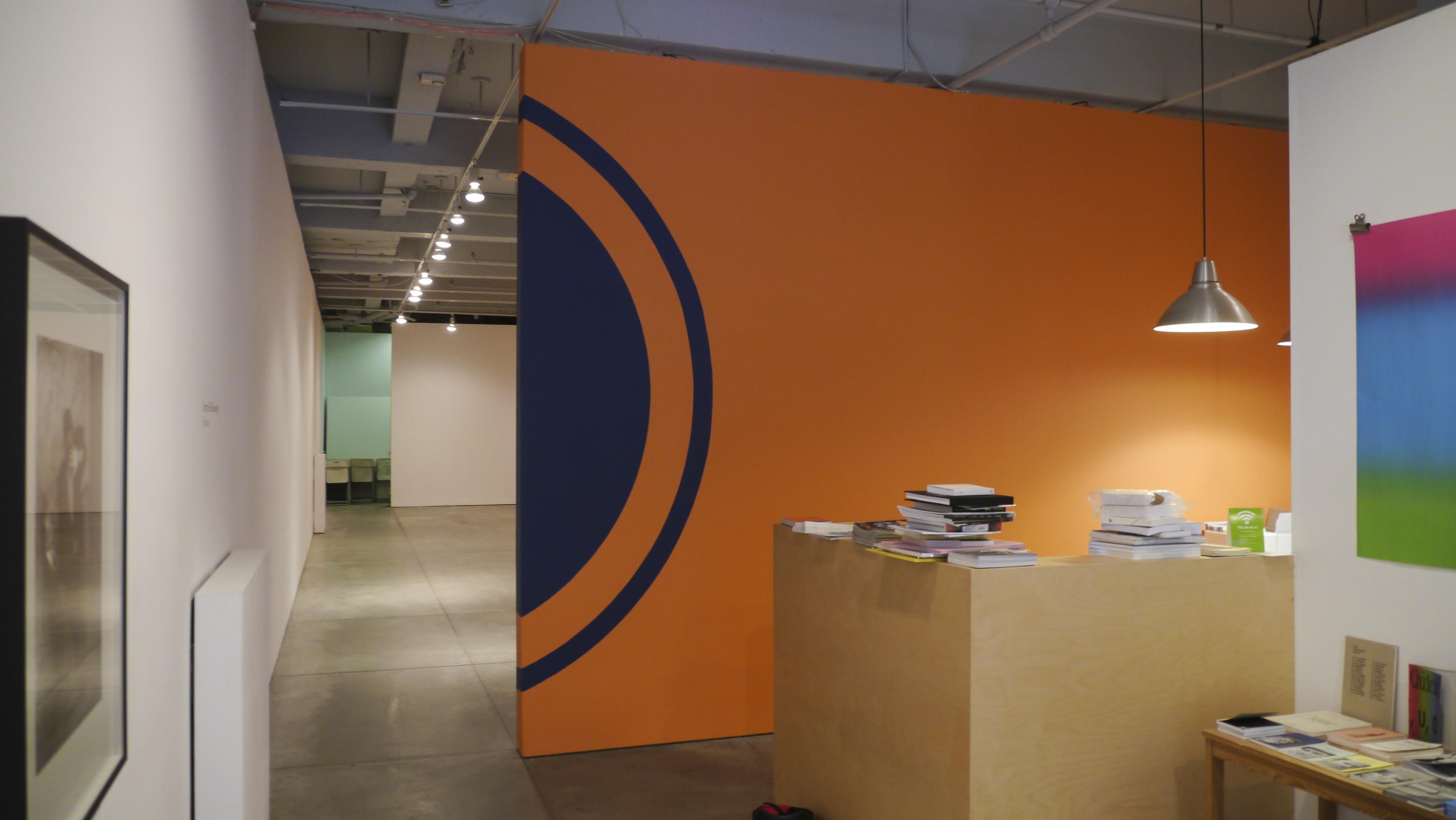
PATTISON, office detail, wall-text painting, Or Gallery, Vancouver, 2013. Photo: Or Gallery
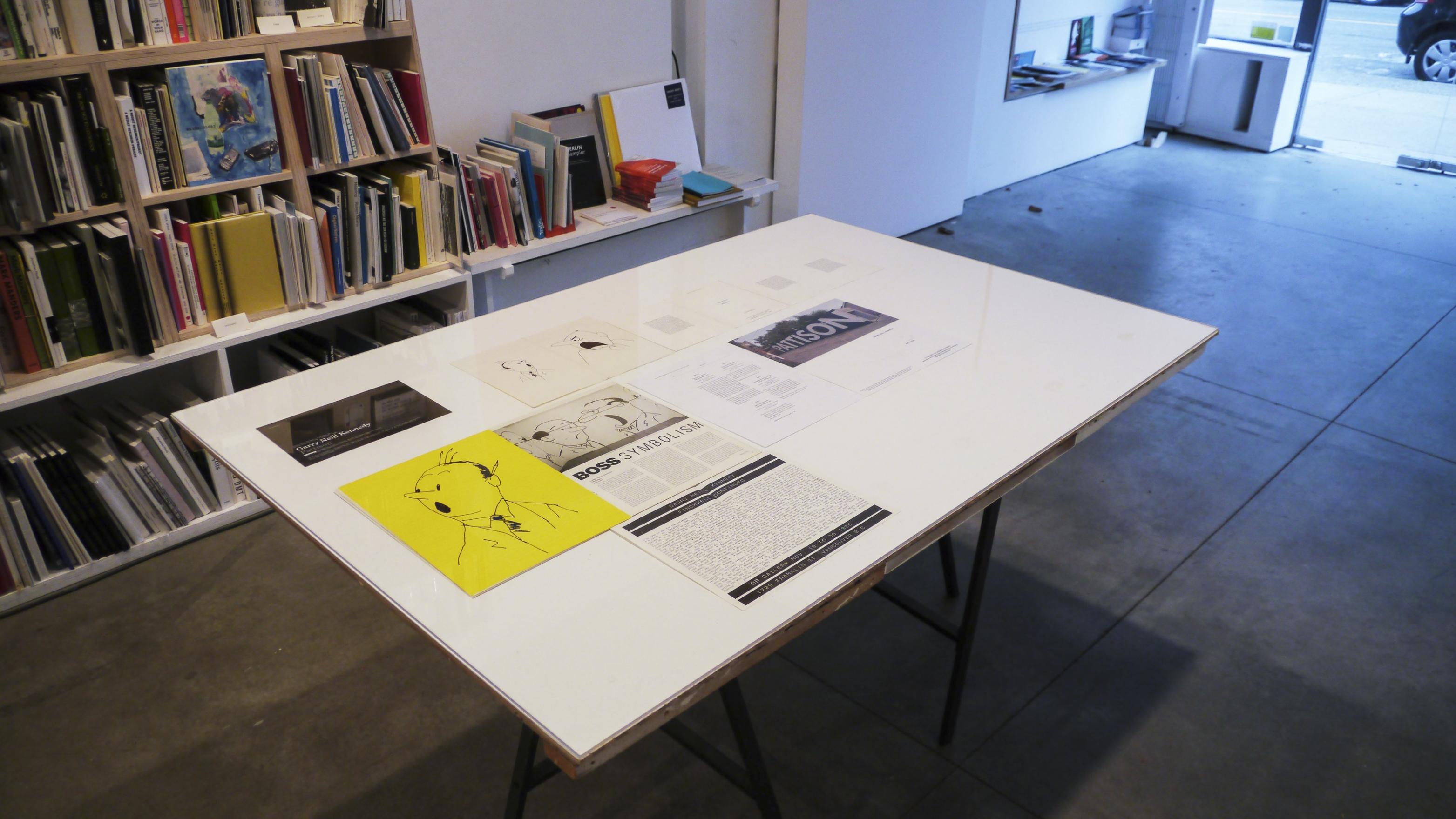
PATTISON, printed matter detail, wall-text painting, Or Gallery, Vancouver, 2013. Photo: Or Gallery
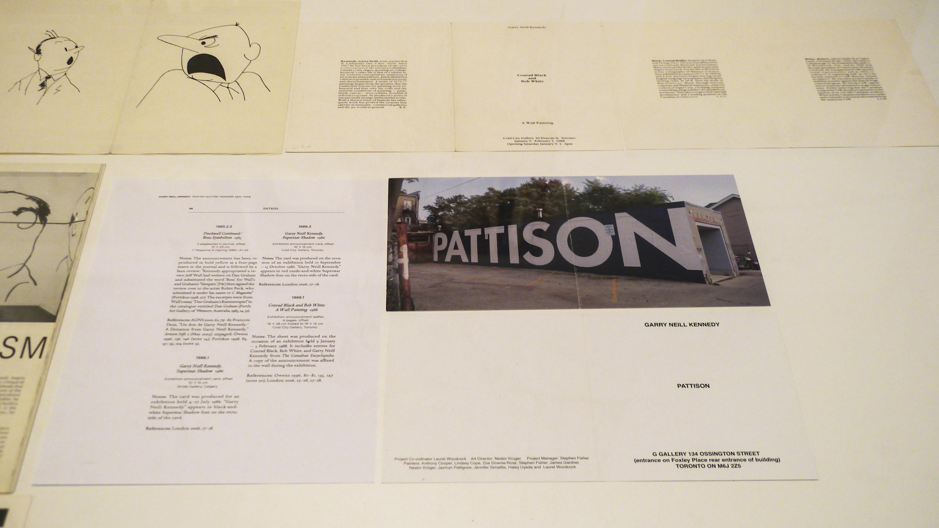
PATTISON, printed matter detail, wall-text painting, Or Gallery, Vancouver, 2013. Photo: Or Gallery
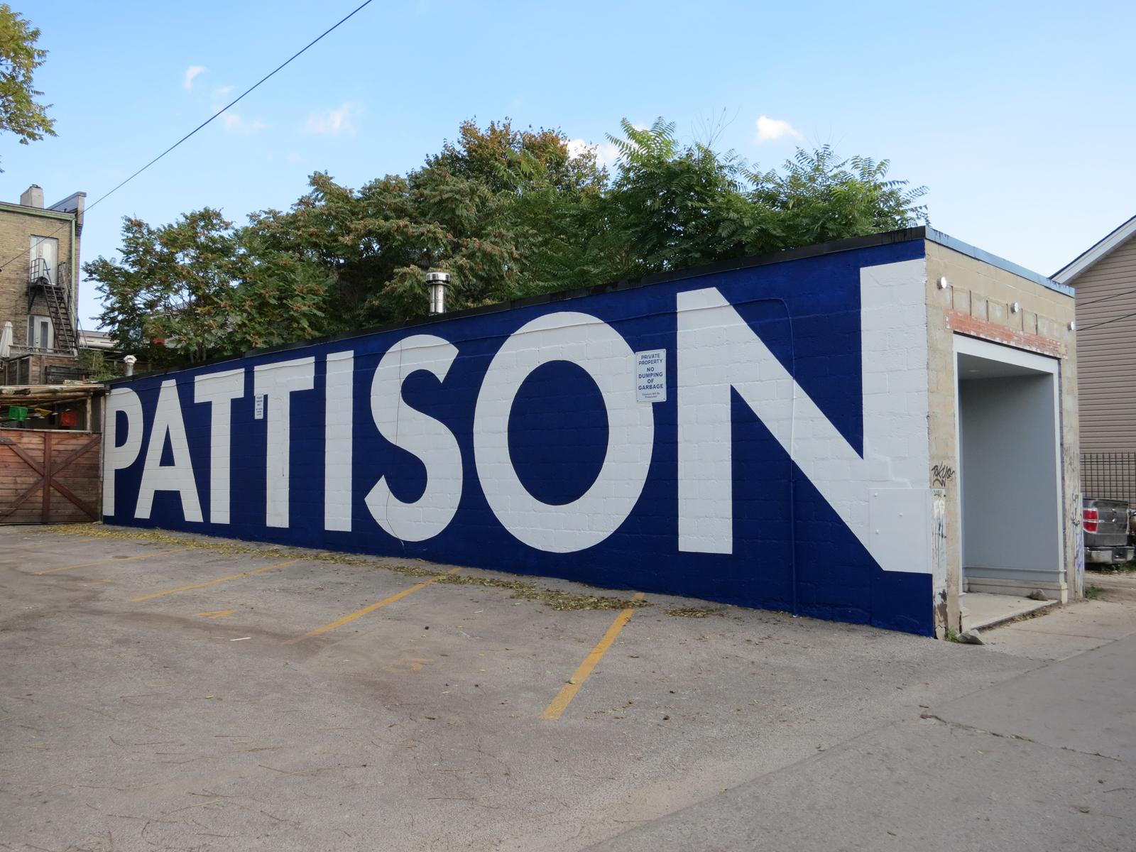
PATTISON, exhibition shot, exterior wall-text painting, G Gallery, Toronto, 2012. Photo: G Gallery
PATTISON (2012)
Kennedy created PATTISON as a work with two iterations. In 2012, he mounted a wall-text installation on the exterior of G Gallery in Toronto. For this large painting Kennedy filled the side of the long cement building with the word "PATTISON" in the blue and white colours used in the Pattison Group's branding. With its scale and placement on this shipping container-like building, Kennedy visually commented on the entanglement of commercial branding with real estate and local art economies.
A year later, Kennedy re-articulated PATTISON at Or Gallery in Vancouver. This time housed inside the gallery, the wall-text painting wrapped around the space in a way which teased the work but also obscured the wording from the viewer until they fully entered the room. For this iteration, Kennedy wrote "BOB RENNIE" in Pattison blue lettering against an orange background, a colour used by Rennie's marketing team around that time. In this way Kennedy used the associated colours to represent the men behind the corporations.
In the accompanying folder, Kennedy wrote brief bios for both James Allen Pattison, an entrepreneur who made his fortune through the ownership of a number of commercial businesses including automotive, airline and grocery, and Bob Rennie, a real estate marketer who transferred his commercial wealth into the art world as both social and monetary currency.
Here, Rennie's name is encircled in a lozenge shaped line. This shape is both used in Pattison's branding, as seen on their billboards throughout the city, and one that nods to minimalist painting; making a visual connection between marketing and art history.
By cheekily bringing Bob Rennie into the dialogue in this iteration of PATTISON, Kennedy highlights the interchangeability of these two corporate mogul's through their approach to business expansionism, and takes note of the corporate imposition on the art world and art market.
This work aligns with Kennedy’s earlier work about work place hierarchies and power dynamics, like in Finchwell Finchwell Finchwell Finchwell & Osborn (1983), as well as his subsequent observations about corporate interchangeability, as in THE BIG FIVE (2014).